

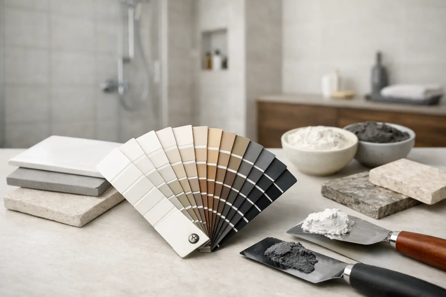
White subway tile with the wrong grout can look builder-basic. The same tile with the right grout can feel crisp, custom, and finished with real intention. If you are wondering how to choose bathroom grout colors, the answer is not just “pick white” or “match the tile.” Grout changes how the entire bathroom reads – from how large the room feels to how much maintenance you sign up for.
In bathroom remodeling, this is one of those small decisions that has a big visual payoff. It also affects how forgiving your surfaces are over time. A grout color that looks perfect on a sample board can behave very differently once it is spread across a shower wall, bathroom floor, or niche under real lighting.
How to choose bathroom grout colors without guesswork
The best starting point is to decide what role you want the grout to play. In some bathrooms, grout should disappear and let the tile take center stage. In others, grout is part of the design and gives the pattern its shape.
If you want a quieter, more seamless look, choose grout close to the tile color. This works well in calm, spa-like bathrooms, especially with large-format tile. Matching grout reduces visual breaks, which can make a smaller bathroom feel more open.
If you want the tile pattern to stand out, go with contrast. Dark grout with white tile is the classic example. It sharpens each tile line and gives the installation a more graphic, intentional look. The trade-off is that every layout choice becomes more visible, so precision matters even more.
That is why grout color should never be treated like an afterthought. It can highlight expert tile work beautifully, but it can also call attention to uneven spacing, lippage, or cuts if the installation is not exact.
Start with the tile itself
Tile should lead the decision, not the other way around. The size, color, finish, and pattern all influence which grout color will feel right.
With large-format tile, a close-match grout usually makes the surface feel cleaner and less busy. This is often the right move for modern bathroom walls and floors where the goal is a smooth, upscale finish. On the other hand, mosaic tile naturally creates more grout lines, so the grout becomes a much bigger part of the overall look. Even a subtle color shift can change the whole design.
Tile undertone matters too. A “white” tile might lean warm, cool, gray, cream, or beige. If the grout undertone fights the tile, the bathroom can look slightly off even if no one can immediately say why. Warm white tile paired with a blue-gray grout may feel harsher than expected. A soft greige grout may be a better fit.
Glossy tile also reflects more light, which can make grout lines appear sharper. Matte tile tends to soften the contrast a little. That difference is worth considering before you commit.
Matching grout creates a quieter look
When grout is close in value and tone to the tile, the eye sees more surface and fewer lines. This approach works especially well for shower surrounds, bathroom floors in smaller spaces, and any design aiming for a clean, timeless result.
It is also a safer choice when you want the vanity, hardware, or stone countertop to carry more of the visual interest. The bathroom feels composed instead of overly busy.
Contrasting grout makes the pattern part of the design
Contrast can look excellent when the tile layout is simple and well executed. Think white subway tile with charcoal grout, or soft gray tile with bright white grout. You get definition, rhythm, and a stronger design statement.
But contrast is less forgiving. Every joint is easier to see. If your taste leans classic and understated, high contrast may feel trendy faster than a close-match grout would.
Think about maintenance before you fall in love with a sample
Bathrooms deal with moisture, soap, hard water, dust, and daily traffic. So the best grout color is not just the one that looks good on day one. It is the one you will still be happy with a year from now.
Very light grout can show dirt and staining more easily, especially on floors. Very dark grout can sometimes show soap residue, mineral buildup, or fading in certain areas. Mid-tone grays, greiges, taupes, and warm neutrals are often the most forgiving choice for busy family bathrooms.
This is where lifestyle should guide the decision. A guest bath can handle a more delicate color choice because it sees lighter use. A primary bath used every day by a household with kids may benefit from a grout color that hides normal wear better.
There is no universal “best” grout color. There is only the best fit for the room, the tile, and the way you live.
Lighting changes everything
One of the most common mistakes homeowners make is choosing grout under showroom lighting and expecting it to look the same at home. It rarely does.
Natural light, vanity lighting, recessed cans, and even wall paint all affect how grout reads. A light gray grout may look soft and neutral during the day, then turn cooler at night under LED fixtures. A beige grout can look warm and welcoming in one bathroom and muddy in another.
If possible, review grout samples in the actual space where the tile will be installed. Hold them next to the tile at different times of day. This step takes a little more patience, but it prevents expensive second-guessing later.
Don’t forget wet vs. dry appearance
Some grout colors look deeper or richer when wet, and bathrooms are full of wet conditions. Shower walls, floors, and splash zones can make grout read darker than expected. That is another reason mockups matter.
A sample board or small test area can give you a much more accurate read than a paper color card ever will.
Popular bathroom grout directions and when they work
White grout still has a place, especially with white tile in bathrooms that are bright, clean-lined, and intentionally crisp. It can look beautiful in the right setting. It just asks more from maintenance.
Light gray is one of the most versatile choices because it softens the starkness of white grout while still keeping a clean feel. It works with many tile styles and tends to age well visually.
Greige and taupe are strong options when the bathroom includes warmer finishes like brass, wood tones, beige tile, or natural stone looks. These colors feel grounded and less clinical.
Charcoal and dark gray can look sharp with white tile or concrete-look tile, but they are best used when you want the grout lines to be seen. In a bathroom with a lot going on already, they may feel too busy.
For natural stone or handmade-look tile, grout often looks best when it blends rather than contrasts. Those materials usually have enough texture and movement on their own.
Floor grout and wall grout do not always need to match
This surprises a lot of homeowners, but it is often the right call. A shower wall may benefit from a lighter, more blended grout to keep the vertical surface calm. The bathroom floor may need a slightly darker, more forgiving grout because it handles more wear.
That does not mean the colors should clash. They should coordinate. Think of them as being in the same family rather than being identical at all costs.
A well-designed bathroom is not about forcing every finish to match exactly. It is about making sure the whole room feels intentional.
How to choose bathroom grout colors with confidence
If you feel stuck between two grout colors, ask a simpler question: do you want to notice the tile shape first, or the tile surface first? If the answer is shape, go more contrasting. If the answer is surface, go closer to the tile color.
Then factor in maintenance, lighting, and how long you want the bathroom to feel current. Trend-forward choices can look great, but classic choices usually offer better staying power.
This is also where experienced installation guidance matters. At My Contractor LLC, we see firsthand how grout selection affects the final result of a bathroom remodel. The right choice supports the tile, the lighting, and the everyday use of the room. The wrong choice can make even premium materials feel less polished than they should.
When in doubt, sample the finalists in the real space and give yourself permission to choose the option that balances beauty with practicality. In a bathroom, the best finish is the one that still looks right after real life starts using it.